Pennsylvania's Changing Climate
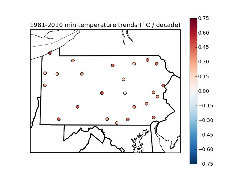
The trend maps (with dots) were taken from the USHCN v2 monthly dataset. To get data from the same time period for all stations, a homogenization algorithm was used. Trends were fit using linear least squares to the yearly averages.
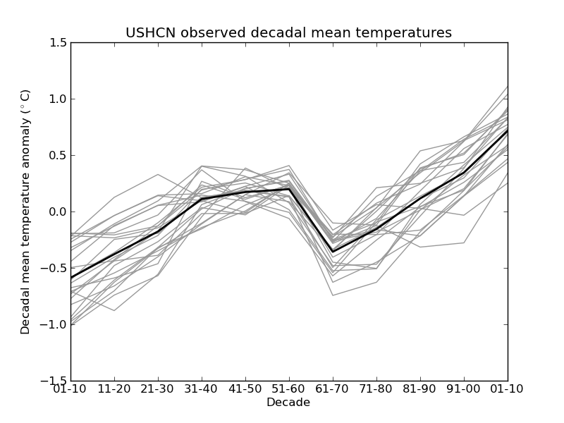
The USHCN decadal temperature graphs use the same data. To normalize everything, each station's time series was converted to an anomaly from the 1895-2010 mean. Each station's anomalies are plotted in gray, and the average of the stations is plotted in thick black.
The observed maps were derived from the University of Delaware datasets. This data was interpolated onto a 0.575° latitude by 0.59°longitude grid by averaging the data points that fell inside each grid box. (This might seem like an odd choice of grid spacing, but it fits grid boxes nicely over PA and allows every dataset to have at least one point inside each grid box). The data is an average of the 1979-1998 time period.
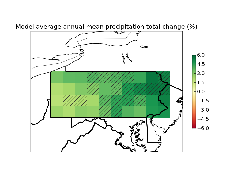
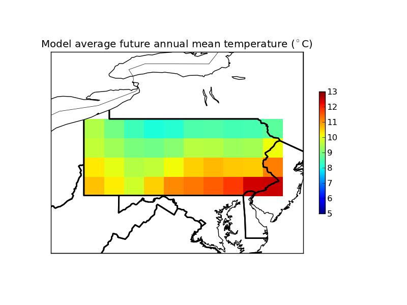
The model maps use data from the NARCCAP project. All 9 currently available models were used. All were interpolated to the same grid using the same method as above. Current maps use the same time period (1979-1998). Future maps use the 2046-2065 time period with A2 emissions scenario. The change maps are the change from the current to the future. Hashed areas indicate where at least 8 out of 9 models agree on the sign of the change.
Recent Trends of Maximum Temperatures in Pennsylvania

Recent Trends of Minimum Temperatures in Pennsylvania
Trends of USHCN Observed Decadal Mean Temperatures
Model Forecast of Annual Mean Temperature in Pennsylvania
Modeled Mean Precipitation Change in Pennsylvania